
1.0.0
Schoolab Components
In addition to the default Bootstrap Components, Schoolab Product Language includes many custom components suited to project management and team-based applications
In addition to the default Bootstrap Components, Schoolab Product Language includes many custom components suited to project management and team-based applications
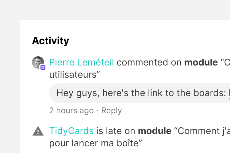
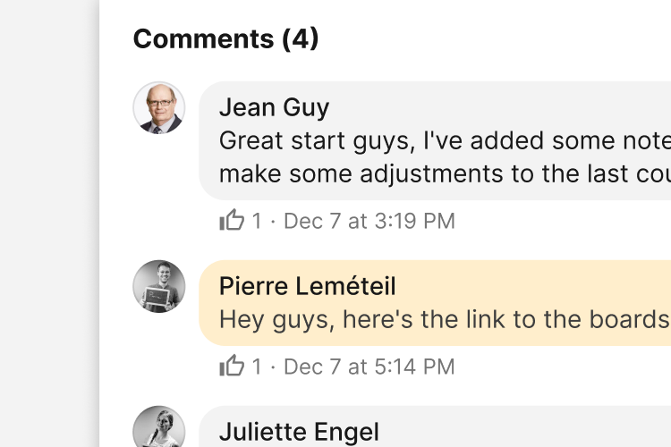
The activity CSS combines the thumbnails and icons and standard Bootstrap List Group as an activity feed.
Code for activity is the same as for meta.

Creation of project
<ol class="list-group list-group-flush list-group-metas">
  <li class="list-group-item">
    <div class="list-group-item--thumbnail thumbnail is-sm is-oval" title="Pierre Leméteil" data-toggle="tooltip">
      <img alt="..." src="...">
    </div>
    <div class="list-group-item--content">
      <span><a href="#">Author</a> performed action on <strong>item type</strong> “Item name”</span>
      <div class="message-body my-2">
        <div class="message-row">
          <div class="message-content">
            <p class="mb-0">Comment content</p>
          </div>
        </div>
      </div>
      <ul class="item-caption metas is-list small">
        <li title="Datetime" data-toggle="tooltip">Date or time ago</li>
        <li><a class="text-reset" href="#">Action</a></li>
      </ul>
    </div>
  </li>
  <li class="list-group-item">
    <span class="list-group-item--icon icon icon-creation"></span>
    <div class="list-group-item--content">
      <p class="my-0">Performed action</p>
    </div>
  </li>
</ol>.list-group-meta
Apply to ol.list-group to format as a meta list or activity feed
.list-group-flush
Apply to ol.list-group to remove some borders and rounded corners to render list group items edge-to-edge in a parent container (e.g., cards).
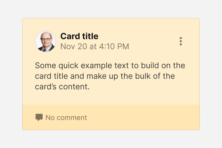
A variation on the card element that simulates a note-like appearance
Some quick example text to build on the card title and make up the bulk of the card's content.
<div class="card">
  <div class="card-body">
    <h5 class="card-title">Card title</h5>
    <p class="card-text">Some quick example text to build on the card title and make up the bulk of the card's content.</p>
    <a href="#" class="btn btn-primary">Go somewhere</a>
  </div>
</div>.card-note
Apply to .card to format as a note
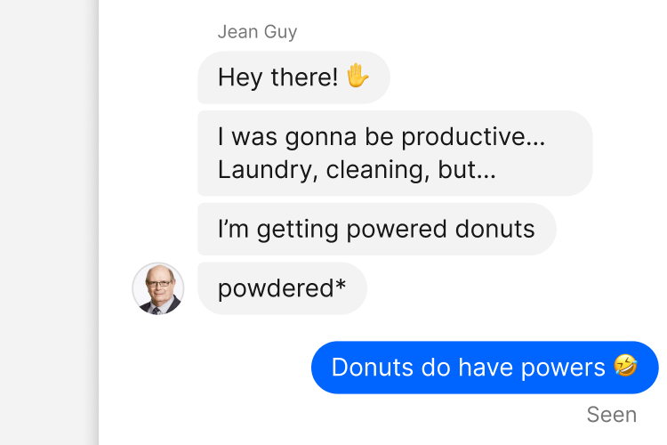
A variation of the media element to format an individual chat message
<div class="message is-left is-bottom is-hover">
  <a class="thumbnail is-oval is-md" href="#" title="..." data-toggle="tooltip">
    <img alt="..." src="...">
  </a>
  <div class="message-body">
    <div class="message-row">
      <a class="smaller text-muted" href="#">Author</a>
    </div>
    <div class="message-list">
      <div class="message-row">
        <div class="message-content" title="Datetime long">
          <p class="mb-0">Content</p>
        </div>
        <div class="message-options dropdown position-static">
          <a class="btn btn-sm btn-transparent btn-icon" href="#" role="button" data-toggle="dropdown" aria-haspopup="true" aria-expanded="false">
            <span class="icon icon-dots-vertical"></span>
          </a>
          <div class="dropdown-menu" style="">
            <a class="dropdown-item" href="#">Edit</a>
            <a class="dropdown-item is-danger" href="#">Delete</a>
          </div>
        </div>
      </div>
    </div>
  </div>
</div>

<div class="message is-right is-bottom is-hover">
  <div class="message-body">
    <div class="message-list">
      <div class="message-row">
        <div class="message-content bg-primary text-white" title="Datetime long">
          <p class="mb-0">Content</p>
        </div>
        <div class="message-options dropdown">
          <a class="btn btn-sm btn-transparent btn-icon" href="#" role="button" data-toggle="dropdown" aria-haspopup="true" aria-expanded="false">
            <span class="icon icon-dots-vertical"></span>
          </a>
          <div class="dropdown-menu">
            <a class="dropdown-item" href="#">Edit</a>
            <a class="dropdown-item is-danger" href="#">Delete</a>
          </div>
        </div>
      </div>
    </div>
  </div>
</div>.message
Apply to <div> element to format as a single message item
.is-right
Apply to .message element to align message rows to the right
.is-bottom
Apply to .message element to align message rows to the bottom (e.g. thumbnail in front of last message)
.is-hover
Apply to .message element to show .message-options on hover
.message-body
Houses the .message-row or .message-list elements
.message-row
Houses the author's name, time or delivery status of the message
.message-list
Houses the .message-row of the chat
.message-content
Houses the message contents of the chat
.bg-primary
Apply to .message-content element to change background color to primary color (for your messages)
.bg-white.text-danger
Apply to .message-content element to change background color to white and text to danger color (for errors)
.message-options
Houses the message options of the chat
A combination of forms and chat items to demonstrate chat functionality
Note, that for the Chat Module to display correctly, the parent element it's housed inside, must have an explicit height.
.chat-module
Parent element to house the Chat Module elements
.chat-module-top
Houses the search form at the top of the module
.chat-module-body
Houses the .chat-item elements for the discussion
.chat-module-bottom
Houses the chat input form
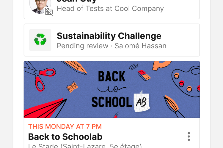
SPL items provide a flexible and extensible meta container with multiple variants and options.
You can insert any component you want into an item, they will be displayed one below the other. To align in a row use .item-row or bootstrap flex helpers.


<div class="item is-bordered">
  <div class="item-cover">
    <a href="#">
      <img src="..." alt="...">
    </a>
    </div>
  <div class="item-row">
    <div class="item-row">
      <div class="item-content py-1">
        <span class="text-date">...</span>
        <a class="item-title h4 mb-0 stretched-link" href="#">...</a>
        <ul class="item-caption metas small is-list">
          <li>...</li>
          <li>...</li>
          <li>...</li>
        </ul>
      </div>
    </div>
    <div class="item-options dropdown">
      <a class="btn btn-sm btn-transparent btn-icon" href="#" role="button" data-toggle="dropdown" aria-haspopup="true" aria-expanded="false">
        <span class="icon icon-dots-vertical"></span>
      </a>
      <div class="dropdown-menu dropdown-menu-right">
        <a class="dropdown-item" href="#">Item option</a>
      </div>
    </div>
  </div>
  <div class="item-row">
    <div class="thumbnail-stack mr-2">
      <div class="thumbnail is-oval is-xs" title="..." data-toggle="tooltip">
        <img alt="thumbnail" src="..." alt="...">
      </div>
      <div class="thumbnail is-oval is-xs" title="..." data-toggle="tooltip">
        <img alt="thumbnail" src="..." alt="...">
      </div>
      <div class="thumbnail is-oval is-xs" title="..." data-toggle="tooltip">
        <img alt="thumbnail" src="..." alt="...">
      </div>
    </div>
    <small class="text-muted">...</small>
  </div>
</div>.item
Makes an item
.is-bordered
Add borders to an item, like a tile
.is-small
Changes the layout of an item to horizontal, appears smaller
.is-disabled
Disable all cursor events on the item, change all texts to muted color and reduce opacity to 75%
.item-row
Creates a row to align element horizontally
.item-cover
Creates a block for a cover image
.item-options
Creates a block for an options dropdown or an action button
.item-actions
Creates a container for 2 buttons maximum
A vertical nav with custom style and compatibility with icons, thumbnails et thumbnail relations.
....nav-main
Apply to .nav to format as custom vertical nav
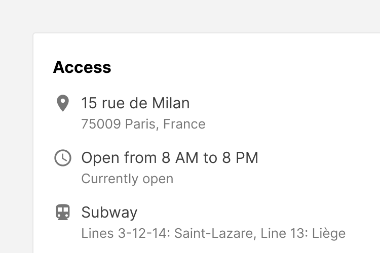
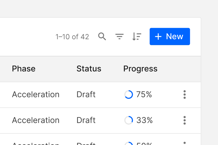
A filter element for lists and tables.
| Full Name | Phase | Status | Progress | |
|---|---|---|---|---|
| Acceleration | Draft |
75%
|
||
| Acceleration | Draft |
33%
|
||
| Acceleration | Draft |
50%
|
...The thumbnail CSS component formats an image as a rounded or oval thumbnail.

<div class="thumbnail is-oval is-xs" title="..." data-toggle="tooltip">
  <img alt="..." src="...">
</div>

<div class="thumbnail is-oval is-sm" title="..." data-toggle="tooltip">
  <img alt="..." src="...">
</div>

<div class="thumbnail is-oval is-md" title="..." data-toggle="tooltip">
  <img alt="..." src="...">
</div>

<div class="thumbnail is-oval is-lg" title="..." data-toggle="tooltip">
  <img alt="..." src="...">
</div>

<div class="thumbnail is-oval is-xl" title="..." data-toggle="tooltip">
  <img alt="..." src="...">
</div>

<div class="thumbnail is-xs" title="..." data-toggle="tooltip">
  <img alt="..." src="...">
</div>

<div class="thumbnail is-sm" title="..." data-toggle="tooltip">
  <img alt="..." src="...">
</div>

<div class="thumbnail is-md" title="..." data-toggle="tooltip">
  <img alt="..." src="...">
</div>

<div class="thumbnail is-lg" title="..." data-toggle="tooltip">
  <img alt="..." src="...">
</div>

<div class="thumbnail is-xl" title="..." data-toggle="tooltip">
  <img alt="..." src="...">
</div>

<div class="thumbnail is-date" title="..." data-toggle="tooltip">
  <span class="month">Dec</span>
  <span class="day">23</span>
</div>.thumbnail
Apply to <div> to format as a thumbnail
.is-oval
Apply to .thumbnail to format as an oval thumbnail
.is-xs
Apply to .thumbnail to reduce default size
.is-sm
Apply to .thumbnail to reduce default size
.is-md
Apply to .thumbnail to reduce default size
.is-lg
Apply to .thumbnail to default size (optional)
.is-xl
Apply to .thumbnail to increase default size
.is-date
Apply to .thumbnail to format as a calendar
Formats a group of thumbnail with thumbnails slightly overlapping

<div class="thumbnail-group">
  <div class="thumbnail is-oval" title="..." data-toggle="tooltip">
    <img alt="..." src="...">
  </div>
  <div class="thumbnail" title="..." data-toggle="tooltip">
    <img alt="..." src="...">
  </div>
</div>.thumbnail-group
Apply to <div> to format as overlapping group of thumbnails
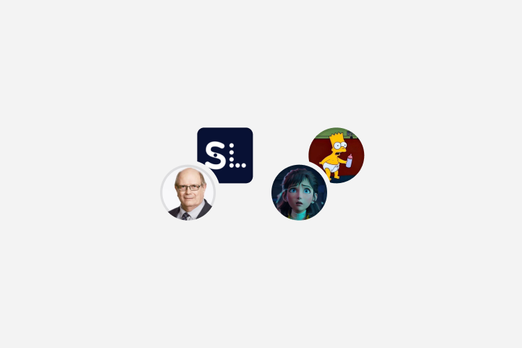
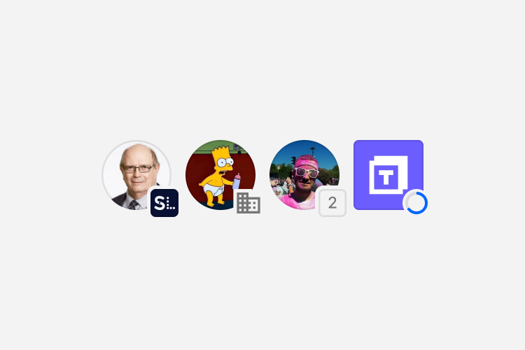
Formats a relation of thumbnail with thumbnails slightly overlapping

<div class="thumbnail-relation">
  <div class="thumbnail is-oval" title="..." data-toggle="tooltip">
    <img alt="..." src="...">
  </div>
  <div class="thumbnail" title="..." data-toggle="tooltip">
    <img alt="..." src="...">
  </div>
</div>

<div class="thumbnail-relation">
  <div class="thumbnail is-oval" title="..." data-toggle="tooltip">
    <img alt="..." src="...">
  </div>
  <span class="icon icon-domain-off" title="..." data-toggle="tooltip">
</div>

<div class="thumbnail-relation">
  <div class="thumbnail is-oval" title="..." data-toggle="tooltip">
    <img alt="..." src="...">
  </div>
  <span class="number">2</span>
</div>

<div class="thumbnail-relation">
  <div class="thumbnail" title="..." data-toggle="tooltip">
    <img alt="..." src="...">
  </div>
  <svg class="progress-circle-container" viewBox="0 0 32 32" data-percent="..." style="--percent:0;" title="..." data-toggle="tooltip">
    <circle class="progress-circle progress-circle-bg"></circle>
    <circle class="progress-circle progress-circle-percent"></circle>
    <text class="progress-circle-text" x="16" y="20">0/9</text>
    <path class="progress-circle-icon is-checked" d="M21.128 9.5L13.948 16.724L10.872 13.624L8 16.52L13.948 22.5L24 12.386L21.128 9.5Z"></path>
  </svg>
</div>.thumbnail-relation
Apply to <div> to format as overlapping group of thumbnails
Formats a stack of thumbnail with thumbnails slightly overlapping


<div class="thumbnail-stack">
  <div class="thumbnail is-oval" title="..." data-toggle="tooltip">
    <img alt="..." src="...">
  </div>
</div>.thumbnail-stack
Apply to <div> to format as overlapping list of thumbnails
A button variation used for navigation.
<a class="btn btn-default btn-tile" href="#">
  <span class="btn--icon icon icon-*"></span>
  <span class="btn--label">...</span>
  <span class="btn--caption">...</span>
</a>.btn-tile
Apply to .btn element to format as a tile
.btn-background
Apply to .btn element to add a background image to the button
.btn--icon
Apply to <span> or <img> element to format as a button icon, image or emoji
.btn--label
Apply to <span> element to format as a button label
.btn--caption
Apply to <span> element to format as a button caption


