Bootstrap Components
In addition to the custom Schoolab Components, Schoolab Product Language includes support for all default Bootstrap 4. View all components at the official Bootstrap Documentation
Provide contextual feedback messages for typical user actions with the handful of available and flexible alert messages.
<div class="alert alert-primary" role="alert">
A simple primary alert—check it out!
</div>
For a detailed specification of the Alerts component including all classes and features please see the official Bootstrap documentation reference
Documentation and examples for badges, our small count and labeling component.
<span class="badge badge-secondary">New</span>
For a detailed specification of the Badges component including all classes and features please see the official Bootstrap documentation reference
Indicate the current page’s location within a navigational hierarchy that automatically adds separators via CSS.
<div class="navbar bg-white breadcrumb-bar">
<nav aria-label="breadcrumb">
<ol class="breadcrumb">
<li class="breadcrumb-item"><a href="#">Home</a></li>
<li class="breadcrumb-item"><a href="#">Library</a></li>
<li class="breadcrumb-item active" aria-current="page">Data</li>
</ol>
</nav>
</div>
For a detailed specification of the Breadcrumb component including all classes and features please see the official Bootstrap documentation reference
Use Bootstrap’s custom button styles for actions in forms, dialogs, and more with support for multiple sizes, states, and more.
<a href="#" class="btn btn-default btn-lg">Large</a>
<a href="#" class="btn btn-default">Default</a>
<a href="#" class="btn btn-default btn-sm">Small</a>
<a href="#" class="btn btn-default">Default</a>
<a href="#" class="btn btn-primary">Primary</a>
<a href="#" class="btn btn-secondary">Secondary</a>
<a href="#" class="btn btn-success">Success</a>
<a href="#" class="btn btn-danger">Danger</a>
<a href="#" class="btn btn-warning">Warning</a>
<a href="#" class="btn btn-info">Info</a>
<a href="#" class="btn btn-light">Light</a>
<a href="#" class="btn btn-dark">Dark</a>
<a href="#" class="btn btn-link">Link</a>
<a href="#" class="btn btn-soft-primary">Primary</a>
<a href="#" class="btn btn-soft-secondary">Secondary</a>
<a href="#" class="btn btn-soft-success">Success</a>
<a href="#" class="btn btn-soft-danger">Danger</a>
<a href="#" class="btn btn-soft-warning">Warning</a>
<a href="#" class="btn btn-soft-info">Info</a>
<a href="#" class="btn btn-soft-light">Light</a>
<a href="#" class="btn btn-soft-dark">Dark</a>
For a detailed specification of the Buttons component including all classes and features please see the official Bootstrap documentation reference
Bootstrap’s cards provide a flexible and extensible content container with multiple variants and options.
Schoolab Product Language also supports multiple custom card types. View them on the Schoolab Components page
Some quick example text to build on the card title and make up the bulk of the card's content.
Go somewhere<div class="card">
<div class="card-body">
<h5 class="card-title">Card title</h5>
<p>Some quick example text to build on the card title and make up the bulk of the card's content.</p>
<a href="#" class="btn btn-primary">Go somewhere</a>
</div>
</div>
For a detailed specification of the Cards component including all classes and features please see the official Bootstrap documentation reference
Toggle contextual overlays for displaying lists of links and more with the Bootstrap dropdown plugin.
<div class="dropdown">
<button class="btn btn-default dropdown-toggle" type="button" data-toggle="dropdown" aria-haspopup="true" aria-expanded="false">
Dropdown button
</button>
<div class="dropdown-menu">
<a class="dropdown-item is-info" href="#">Login as Jean Guy</a>
<div class="dropdown-divider"></div>
<a class="dropdown-item" href="#">Show profile</a>
<a class="dropdown-item" href="#">Edit profile</a>
<div class="dropdown-divider"></div>
<a class="dropdown-item" href="#">Edit participation</a>
<a class="dropdown-item is-danger" href="#">
<div class="dropdown-item--label with-caption">
<span>Jean Guy left Schoolab</span>
<span class="caption">Add a departure date to the participation</span>
</div>
</a>
</div>
</div>
For a detailed specification of the Dropdowns component including all classes and features please see the official Bootstrap documentation reference
A brief example of Bootstrap's default form markup. See the Bootstrap Documentation for a more detailed reference.
Schoolab Product Language also supports multiple custom form types. View them on the Schoolab Components page
<form>
<div class="form-group">
<label for="exampleInputEmail1">Email address</label>
<input type="email" class="form-control" id="exampleInputEmail1" placeholder="Enter email">
<small id="emailHelp" class="form-text text-muted">We'll never share your email with anyone else.</small>
</div>
<div class="form-group">
<label for="exampleInputPassword1">Password</label>
<input type="password" class="form-control" id="exampleInputPassword1" placeholder="Password">
</div>
<div class="form-group custom-control custom-checkbox">
<input class="custom-control-input" id="customCheck1" type="checkbox" />
<label class="custom-control-label" for="customCheck1">Check me out</label>
</div>
<button type="submit" class="btn btn-lg btn-block btn-primary">Submit</button>
</form>
For a detailed specification of the Forms component including all classes and features please see the official Bootstrap documentation reference
A brief example of Bootstrap's default Input Group markup. See the Bootstrap Documentation for a more detailed reference.
<div class="input-group">
<input class="form-control" type="number" placeholder="0" aria-label="Booking limit">
<div class="input-group-append">
<span class="input-group-text">hours</span>
</div>
</div>
For a detailed specification of the Input Group component including all classes and features please see the official Bootstrap documentation reference
A brief example of Bootstrap's default List Group markup. See the Bootstrap Documentation for a more detailed reference.
<ul class="list-group">
<li class="list-group-item">Cras justo odio</li>
<li class="list-group-item">Dapibus ac facilisis in</li>
<li class="list-group-item">Morbi leo risus</li>
<li class="list-group-item">Porta ac consectetur ac</li>
<li class="list-group-item">Vestibulum at eros</li>
</ul>
For a detailed specification of the List Group component including all classes and features please see the official Bootstrap documentation reference
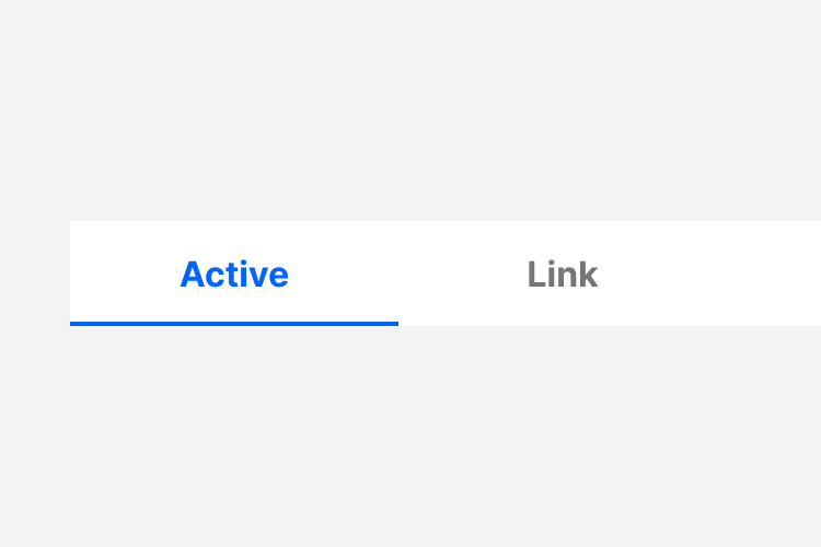
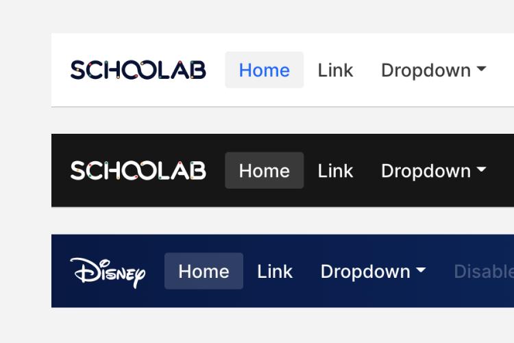
A brief example of Bootstrap's default Navs markup. See the Bootstrap Documentation for a more detailed reference.
<nav class="nav nav-tabs nav-justified">
<a class="nav-item nav-link active" href="#">Active</a>
<a class="nav-item nav-link" href="#">Link</a>
<a class="nav-item nav-link disabled" href="#">Disabled</a>
</nav>
For a detailed specification of the Navs component including all classes and features please see the official Bootstrap documentation reference
A brief example of Bootstrap's default progress bar markup. See the Bootstrap Documentation for a more detailed reference.
<div class="progress">
<div class="progress-bar" role="progressbar" style="width: 25%" aria-valuenow="25" aria-valuemin="0" aria-valuemax="100"></div>
</div>
For a detailed specification of the Progress component including all classes and features please see the official Bootstrap documentation reference
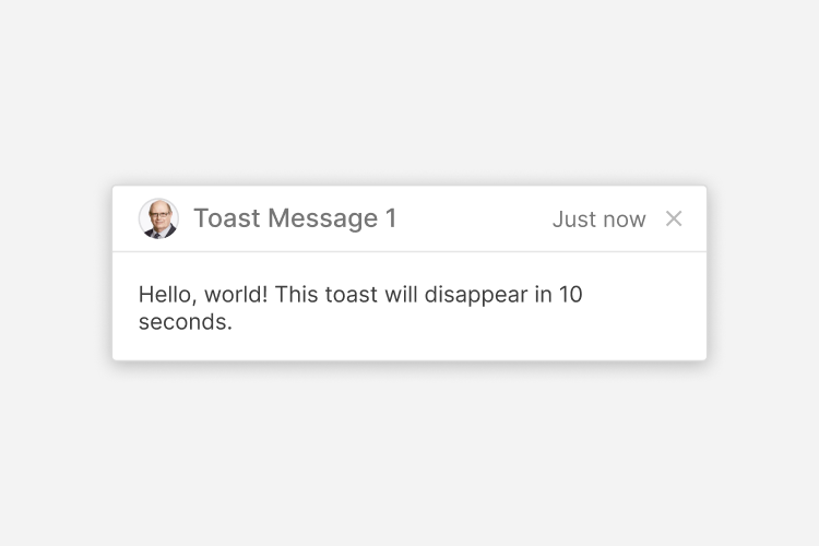
A brief example of Bootstrap's default toasts. See the Bootstrap Documentation for a more detailed reference.
<div class="toast" role="alert" aria-live="assertive" aria-atomic="true">
<div class="toast-header">
<div class="thumbnail is-sm is-oval mr-3">
<img src="..." alt="...">
</div>
<strong class="mr-auto">Bootstrap</strong>
<small>11 mins ago</small>
<button type="button" class="ml-2 mb-1 close" data-dismiss="toast" aria-label="Close">
<span aria-hidden="true">×</span>
</button>
</div>
<div class="toast-body">
Hello, world! This is a toast message.
</div>
</div>
For a detailed specification of the Toasts component including all classes and features please see the official Bootstrap documentation reference
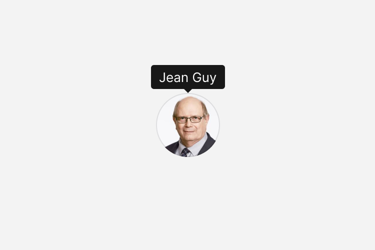
A brief example of Bootstrap's default tooltips. See the Bootstrap Documentation for a more detailed reference.
<div class="thumbnail is-xl is-oval" title="Jean Guy" data-toggle="tooltip">
<img alt="..." src="...">
</div>
For a detailed specification of the Tooltips component including all classes and features please see the official Bootstrap documentation reference